Reports
Business analytics for your gym, organized into three tabs: Growth, Attendance, and Financial.
Period Filter
The period dropdown appears only on the Attendance tab (the Growth and Financial tabs use their own fixed windows). The options are Last 30 days, Last 60 days, Last 90 days, Last 6 months, and Last year. Changing it updates the Attendance charts and metrics.
Growth Tab
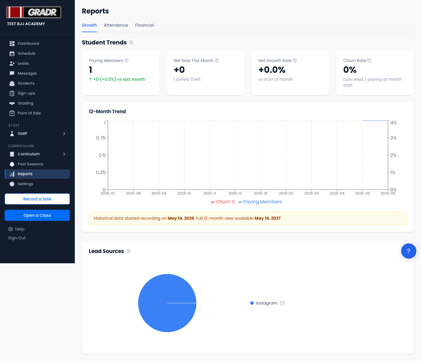
Tracks membership momentum, independent of the period filter.
Student Trends shows four headline metrics plus a 12-month trend chart:
- Paying Members — your current count of paying students.
- Net New This Month — members gained minus members lost this month.
- Net Growth Rate — net change as a percentage of your base.
- Churn Rate — the rate at which members are leaving.
Lead Sources is a pie chart breaking down where your leads came from (referral, social media, walk-in, etc.), drawn from the referral-source field on each record.
Attendance Tab
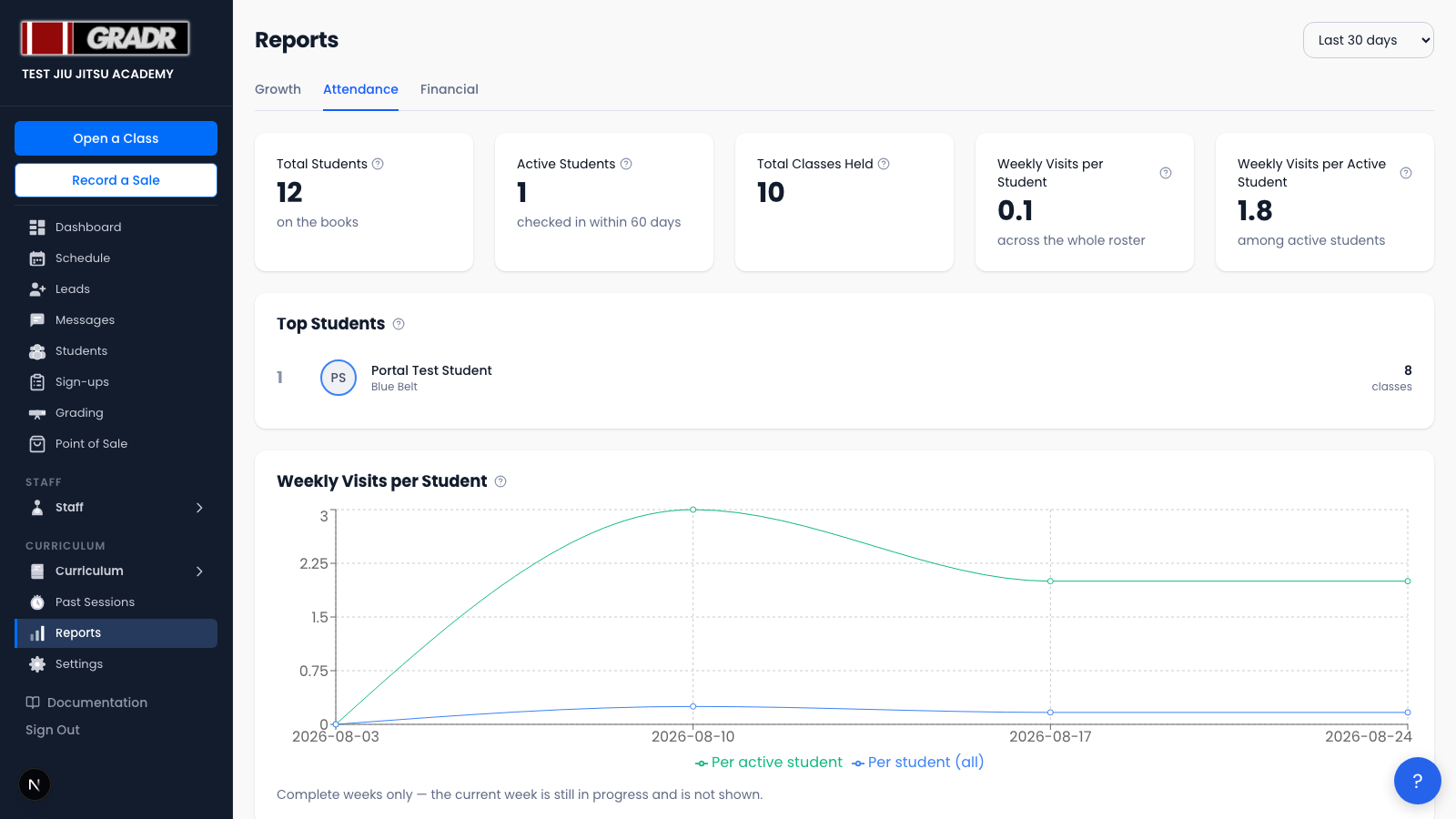
Tracks class participation and instructor performance. This is the only tab affected by the period filter (except where noted).
Four roster-health cards sit at the top:
- Total Students — every student record, regardless of status.
- Active Students — students who checked in at least once in the last 60 days (a fixed window, not the selected period).
- Total Classes Held — sessions that ran in the selected period.
- Weekly Visits per Student — how many classes the average student attended per week, counting every student on your books. Members who are paying but never turning up drag this down, which is the point.
- Weekly Visits per Active Student — the same figure counting only students who checked in at least once in the last 60 days. This shows how hard your engaged members train, ignoring dormant records.
Read the two together. A wide gap between them means a large share of your members aren't training; a fall in the second one is the more serious signal, because it means your regulars are slowing down.
Below the cards:
- Top Students — the three students with the most check-ins in the period.
- Weekly Visits per Student (chart) — the two figures above plotted week by week. Both lines keep the same denominator across the whole chart, so a drop means visits genuinely fell rather than the group being measured changing. The current week is left out because it's still in progress and would always look like a dip.
- Daily check-ins — a trend line of check-ins per day.
- Most popular classes — ranked by average attendance per session.
- Instructor popularity — instructors ranked by average attendance in classes they coached.
- Belt Distribution — your active base by belt rank, shown separately for Adults and Kids.
Every attendance figure on this tab counts a class on the day it was held, not the day it was entered. So a class you record a week late still lands in the week it actually ran. See Recording a Past Class.
Financial Tab
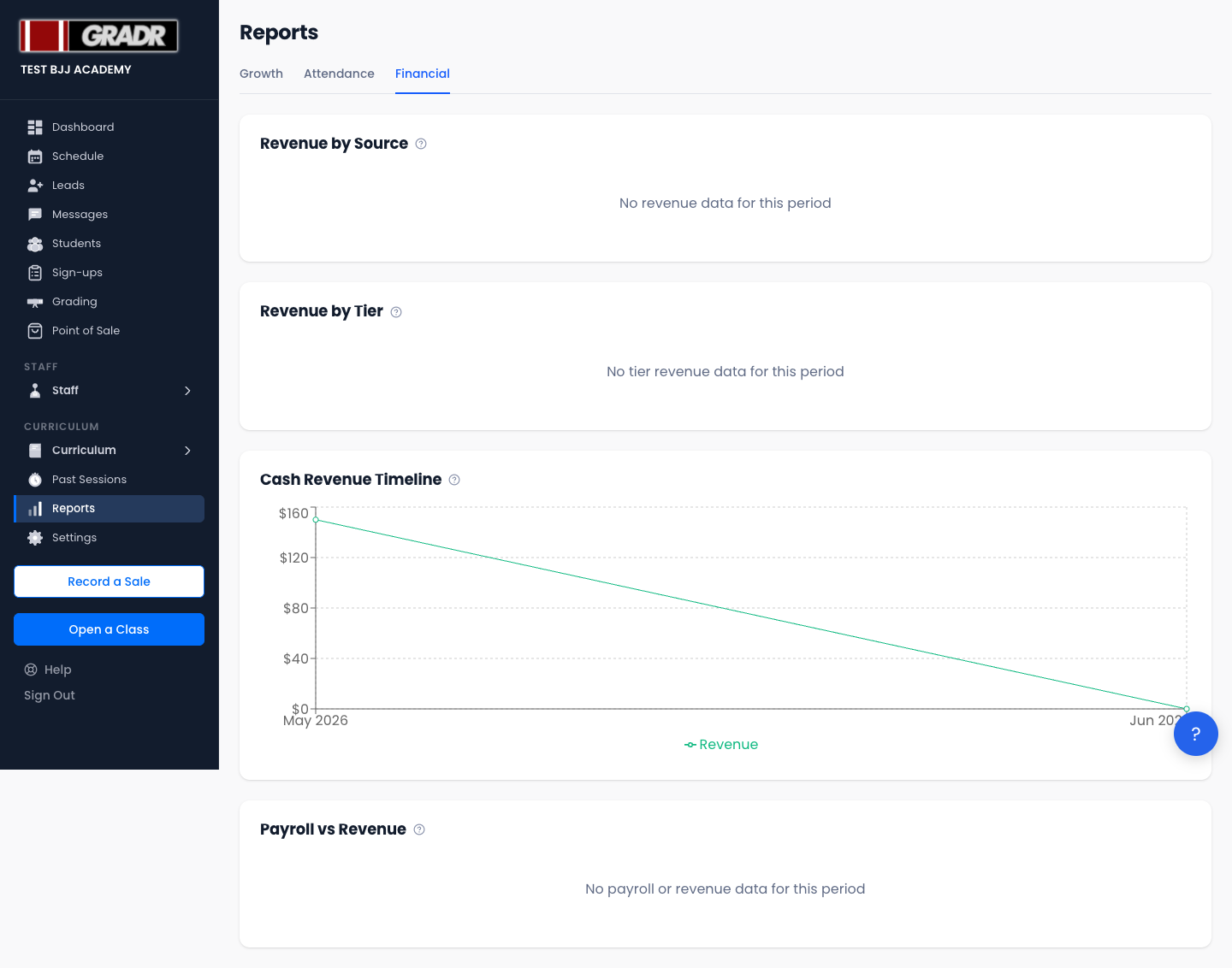
Tracks revenue and payroll health.
- Revenue by source — Stripe vs. cash payments.
- Revenue by Tier — which membership tiers generate the most revenue.
- Cash Revenue Timeline — a month-by-month chart of cash collected.
- Payroll vs revenue margin — instructor payroll as a share of revenue, so you can track staffing cost.
Related
- Past Sessions — correct the attendance data that feeds these reports
- Dashboard — at-a-glance KPIs drawn from the same underlying data
- Settings — Payments — revenue and payment settings behind the Financial tab